GEICO
- Role: Sr UX Researcher
- Timeline: 6pm Yesterday - Now
- Tools: Adobe Photoshop, Adobe Premiere, Invision, Omnigraffle, Peek(Usertesting.com), Sublime Text, Survey Monkey, Sharpie Pen and Paper, Usability Testing Kit (self compiled)
Client: The Government Employees Insurance Company (GEICO) is the second largest auto insurer in the United States. It is a wholly owned subsidiary of Berkshire Hathaway that as of 2007 provided coverage for more than 13 million motor vehicles owned by more than 12 million policy holders. GEICO writes private passenger automobile insurance in all 50 U.S. states and the District of Columbia.
Challenge:
1. How would you suggest organizing content on this view? Please create a set of wireframes and/or low or high fidelity mockups to show how you would reorganize this view if you were the designer assigned to overhaul it.
2. How would you go about verifying or testing your design?
3. How is this task similar or dissimilar to work you have done in the past?
Outcome:
Question 1 - How to do great work with this question and in a way it demonstrates whats important in my process and will allow me to tell the story well within the constraint of i.) producing an answer in ~ 12 hours and ii.) me being out of town from Monday 6/29 - Thursday 7/2.
Answer 1 - Methodologies leveraging remote access and creation of a static page with video that can be consumed/considered without respect to my immediate availability. Something that would allow me to expand with in person stand up.
My flow looked something like this -
DISCOVERY
Initial State User Testing
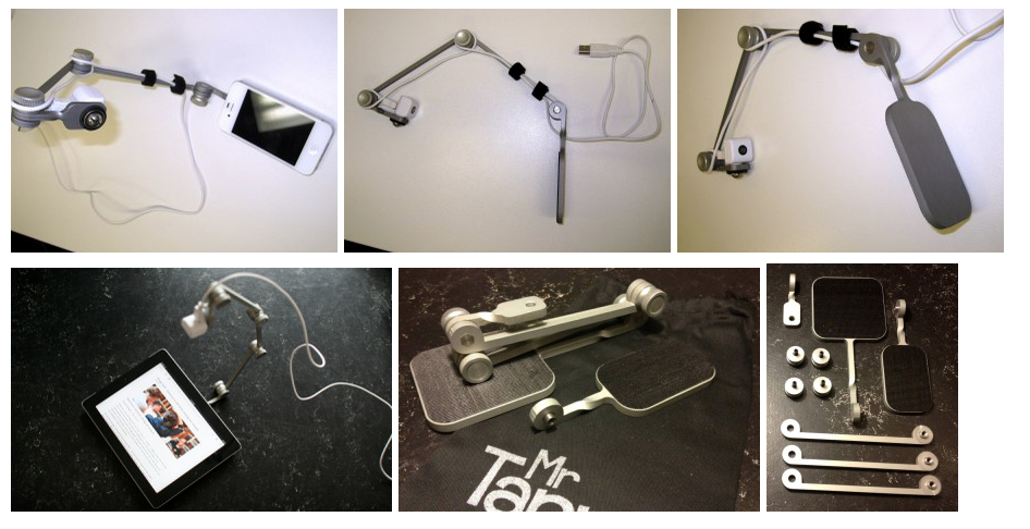
Being a bit of a "toolkit junkie", I utilized my current mobile usability testing rig to record a small number of real world users interacting with the app. I chose not to provide moderation to the recording session in order to i.) not bias the scope of the results and ii.) to inspire the participants to feel free in exploring the app without relying on my instruction.
User Surveys
I deployed a day one survey to collect data that might yield insight towards a design direction and also what drives people use of a solution like the Geico mobile app. Given the constraint of time, but wanting a quasi legitimate sampling, I chose to deploy a survey I constructed to a SurveyMonkey "audience" which I knew would yield results in a matter of hours. This is not the highest quality data from a number of perspectives, and could be significantly improved upon given more time and greater resources.
The survey population proved to have adequate demographic distribution across ages, gender, income level, and geographical region. Examples of some of the findings are presented in the "Collect Discover Data" section.
Competitive analysis


Conducting a brief competitive analysis allowed me to narrow the focus of comparison to the top 5 Geico competitors. This step began to yield interesting observations which would heavily inform my thinking.
Design
My first generation design concept was to re-organize the content based on the basis of immediacy of need for the most user-sensitive/intense scenario(s). The thought driving this choice was "can Geico be there through this tool in the event of an accident."
Module location top to bottom were reorganized according to this principle.
Prototype
I constructed a hi-fidelity clickable prototype (with the re-organized structure) using InVision. I selected this tool as I knew I would be able to supply the unique URL of the product to use with Usertesting.com (Peek) for usability.
collect discovery data
Survey Instrument Results


Initial State User Test Results
Reflect & Iterate Direction
At this point, I realized, however cliche, that given the prompt of being the designer tasked with re-organizing this app I would come to the conclusion that it should not be reorganized. Through this process I discovered carefully designed choices that make it not only the market leader in terms of what it is offering (by a wide margin) but choices that also best serve the users of the product and the unique business goals (assumed admittedly on my part) of Geico.
Some of those observations include:
I.) Organization of modules based on what people actually use the app for (payment and ID over reaching out in event of accident)
II.) Use of space/accessibility from the perspective of finger/hand dexterity
III.) Data populated areas from the landing view, not requiring any drill down
IV.) Iconography which is clear in its communication and a color scheme to the iconography that matches the module flow
V.) Voice interaction functionality
All of these design choices are user centered and add value, and are market unique (with the exception of the use of space in the "tappable" module area, and in this case only Liberty Mutual matches this positive design choice. Bravo! Let me meet those who worked towards this current state and lets get to work doing more great design.
USABility testing
(remote, quick, and yielding data to continue iterating foward)


